Lost in Confusion
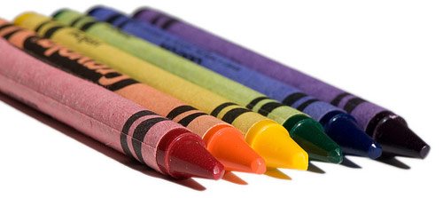
“Never invest in an idea that can’t be explained with a crayon.”
—Peter Lynch
Legendary American Investment Professional
(1944 — )
“Be Sincere. Be Brief! Be seated!”
—John Hancock
American Founding Father
(1737—1793)
Why such awful, numerous, incomprehensible presentations?
There may be a misconception operating out there: “That things can actually be totally and completely explained.” Allow us to explain: It ain’t so! Many among us are just a little OCD, and operate from the assumption that “More explanation is better.”
This may be the formula:
Good Intentions + Ample Information + Great Tools = Bad Presentations!
More Chocolate Ice Cream? Great! More Fun? Terrific!
More Slides? More Charts? More graphs? Emphatically, NO!
Just as a Point of Information, Madame Chairman: a Chart is not a Visual Aid! Neither is a Graph. Nor a page of neatly arranged numerical columns. Nope. It’s an Anesthetic. Just more stuff to be deciphered, decoded.
No, a Visual Aid is a picture, a cartoon, a symbol, a prop, a demonstration, an example. Something that adds to the understandability of the presentation without recourse to reading or decoding. Bonus Points for aiding the memorability of the presentation.
Bad to Worse
Instead of making life more understandable, PowerPoint has had exactly the opposite effect. Because it is such a powerful tool, we can now create three or four times as many ungainly screens, slides or handout pages (or all of these). So instead of dense or barely understandable presentations, we now have impenetrable and incomprehensible presentations. And for added confusion, we can effortlessly coordinate with both Word and Excel to multiply the number of wordy paragraphs and numbing charts that take us far into the realm of incomprehensibility!
Begin with the assumption that your function as a presenter is to absorb the available information, sort out the most important points and recommend an outcome for the listeners to decide upon. If you simply bring all the data, you become nothing more than another data access tool…
Instead, reach a conclusion yourself, then create a short, clear, well structured, memorable presentation with a chart, a graph, a picture or symbol for each section and a quote or a story to build the theme. You’ve now covered the readers, the listeners, the analysts, the emotives, the kinesthetics, the visual players and those with ADHD!
You can create all this with PowerPoint, and make it neat to boot. But if you’re working fast and light, try a crayon!
Applications
1. Personally
Before you attempt conquering More, get really accomplished with Less!
Writing, Presenting, Conversing and Coordinating all benefit from simplicity and brevity. You’ll get a reputation as someone who can be understood…
2. At Home
Who listens to family members anyway? So make your attempts to be understood simple, concise and structured for memorability. Consider composing your remarks when a spouse or a child must Get It! If it’s good enough for a boss, a colleague or the public, why not for the family? It’s absolutely more important at home. Go practice in the closet, at the bar with a friend, then go home for the big event.
3. At Work
Resist the urge to bulk up on screens, slides or handouts. Enough is most definitely enough! Especially when “Presenting Up” to Senior Management. Make sure you’ve got the bases covered, but give the short version first, and keep the volumes of research at hand as backup. If they have questions, pull out the big guns and prove you did your homework.
Don’t misunderstand! PowerPoint is indeed powerful! But it’s responsible for the lion’s share of bad presentations by making it easier than ever to overwhelm the audience and leave them lost in confusion!
Work with sincerity and a crayon (with the charts for backup) and you can’t go wrong!
Subscribe to our Newsletter